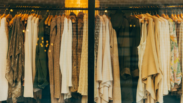
Fall Colour Does Not Mean the Same Brown for Everyone
Colour analysts are adapting olive, rust and burgundy to individual undertone rather than prescribing one autumn palette. LCY verdict: personalise the trend palette; do not surrender personal style to a chart.

Autumn colour is no longer limited to brown
Fashion often greets autumn with the same reflex: chocolate, camel, burgundy and khaki. The 2026 collections open that safe palette with electric blue, royal purple, vivid red, peach, turquoise and butter yellow. Vogue’s 21 August seasonal report shows colour returning through everything from small accents to full monochrome. At the same time, social media colour-season analysis tells users which shades supposedly belong to them. One trend sells saturation to everyone; the other says each person should stay in a narrow palette. LCY sees a better middle ground: runway colour is an invitation and personal analysis can be an experiment, but neither should become a rulebook that overrides identity, comfort or the clothes already owned.
Why now
After a long cycle of minimalism, colour offers a relatively low-risk identity update. A purple bag, red sock or blue knit can refresh an outfit without replacing an entire wardrobe. During economic uncertainty, that small intervention may feel more accessible than a complete seasonal reset. Saturation also performs well on screens, where editorial and social algorithms reward immediate visual contrast. Colour analysis has a different appeal: a limited “right” palette promises less decision fatigue and fewer mistaken purchases. Yet it is not a clinical diagnostic system. Lighting, camera processing, hair colour, makeup, fabric texture and individual contrast preference all affect the result. What looks harmonious is partly contextual and partly cultural, not a single objective property waiting to be measured.
Runway colour versus real life
A seasonal report observes recurrence across collections; it does not prescribe what every person should wear. Electric blue can look commanding on a runway but behave differently under office light, next to the face or in a soft knit. Placement matters: a colour near the complexion, on the lower body or in an accessory creates different relationships. Someone who feels energised in purple need not abandon it because a chart declares the undertone wrong. LCY translates trend into three practical questions. Where will the colour sit? How many combinations can it make with the existing wardrobe? Will the wearer want it again after the photograph? The simplest sustainability measure in personal style is repeated use, not conformity to this season’s colour name.
What colour-season analysis can do
Seasonal colour systems generally organise palettes around warm versus cool undertone, light versus deep value and low versus high contrast. This framework can narrow an overwhelming shop and help someone notice shades they enjoy. There is no universal measuring instrument, protocol or clinical accuracy threshold. Different consultants can assign the same person to different seasons; phone filters and automatic white balance introduce more variation. Skin is not a static paint card: illumination, tanning, redness and surrounding materials change perception. The system is most useful as a comparison protocol in front of a mirror, not as a prohibited list. It can generate vocabulary and curiosity while leaving room for mood, culture and deliberate visual tension.
How to personalise the 2026 palette
Test a trend colour on a small surface before making a large investment. Try electric blue in a scarf rather than a coat, red in a shoe rather than a complete look, or purple away from the face if that feels easier. Photograph the shade in daylight and indoors, but do not make the camera the final judge. Surface changes colour: velvet deepens burgundy; satin throws it forward. A fashionable shade that cannot work with three existing pieces may remain lonely in the wardrobe. LCY’s three-outfit test is a useful purchase gate. If the item cannot make at least three real combinations without requiring more new shopping, pause. Personalisation should reduce friction and waste, not create a new shopping assignment.
Where the hype begins
Claims that one colour makes everyone look ten years younger or that a “wrong” colour makes a face unhealthy turn subjective perception into pseudo-scientific certainty. Declaring a new essential shade every season can also accelerate inventory and consumption. Trends can be joyful, but discarding a good burgundy item because this year’s red is brighter is not sustainable. Automated tone analysis may be unreliable across darker skin, changing light and makeup. Even professional advice remains a service rather than an authority over self-expression. The useful test is whether a system helps someone wear more of what they own and feel more intentional. If it replaces curiosity with fear of getting colour wrong, the tool has become the problem.
LCY interpretation
Our Trend Score is 90/100: multiple runways, retailers and current editorial reports point toward saturated colour. Evidence is C because the trend signal is strong while universal claims for personal colour systems lack a standard scientific basis. LCY welcomes the 2026 palette for breaking the automatic brown autumn, but prefers the formula “one strong colour plus the existing wardrobe.” A colour season can offer language and focus; it is not a passport. The most reliable sign that a shade belongs to someone is voluntary, repeated wear. Style works when a person uses a framework and then edits it. It fails when the framework turns preference into compliance.
What we still do not know
We do not know whether the social colour-analysis boom reduces shopping or creates another service and product category. How consistent are screen-based tools across skin tones and devices? What happens to promoted shades on resale markets after the season? These questions need data beyond viral before-and-after images. LCY’s conclusion is simple: autumn 2026 is generous with colour, and brown is no obligation. Use the palette as a prompt, test it in small doses and connect it to pieces already present. Personal style is less about entering the correct box than about making a choice and standing behind it. Trend Today. Evidence Before Hype.
Sources
Vogue — Fall 2026 colour trends, 21 August 2026 (opens in a new tab)
Byrdie — Saturated Fall 2026 colour report (opens in a new tab)
Vogue Business — AI colour analysis and avatar context (opens in a new tab)